Death Wish Sauces
Hot Sauce Branding
Death Wish Sauces is the creation of two local Florida Boys pushing the boundaries on spicy innovations with the freshest local ingredients. Gaze into the fire and melt your tastebuds with this tantalizing hot sauce brand.
Launch Website- ClientTom House
- IndustryFood Processing / Hot Sauce
- ServicesArt Direction, Branding, Print Design, Package Design, Business Cards, Labels, Stickers, Packing Tape, Website
- Websitewww.deathwishsauces.com
01
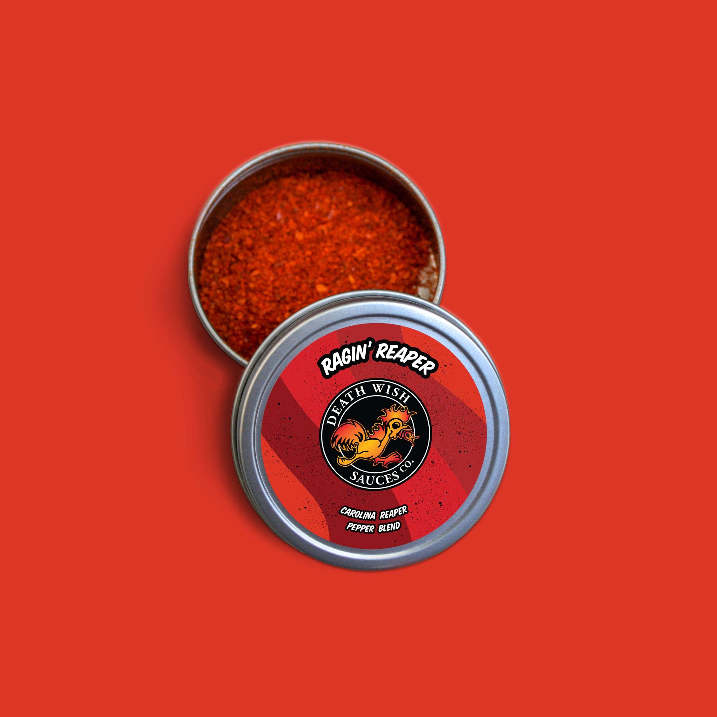
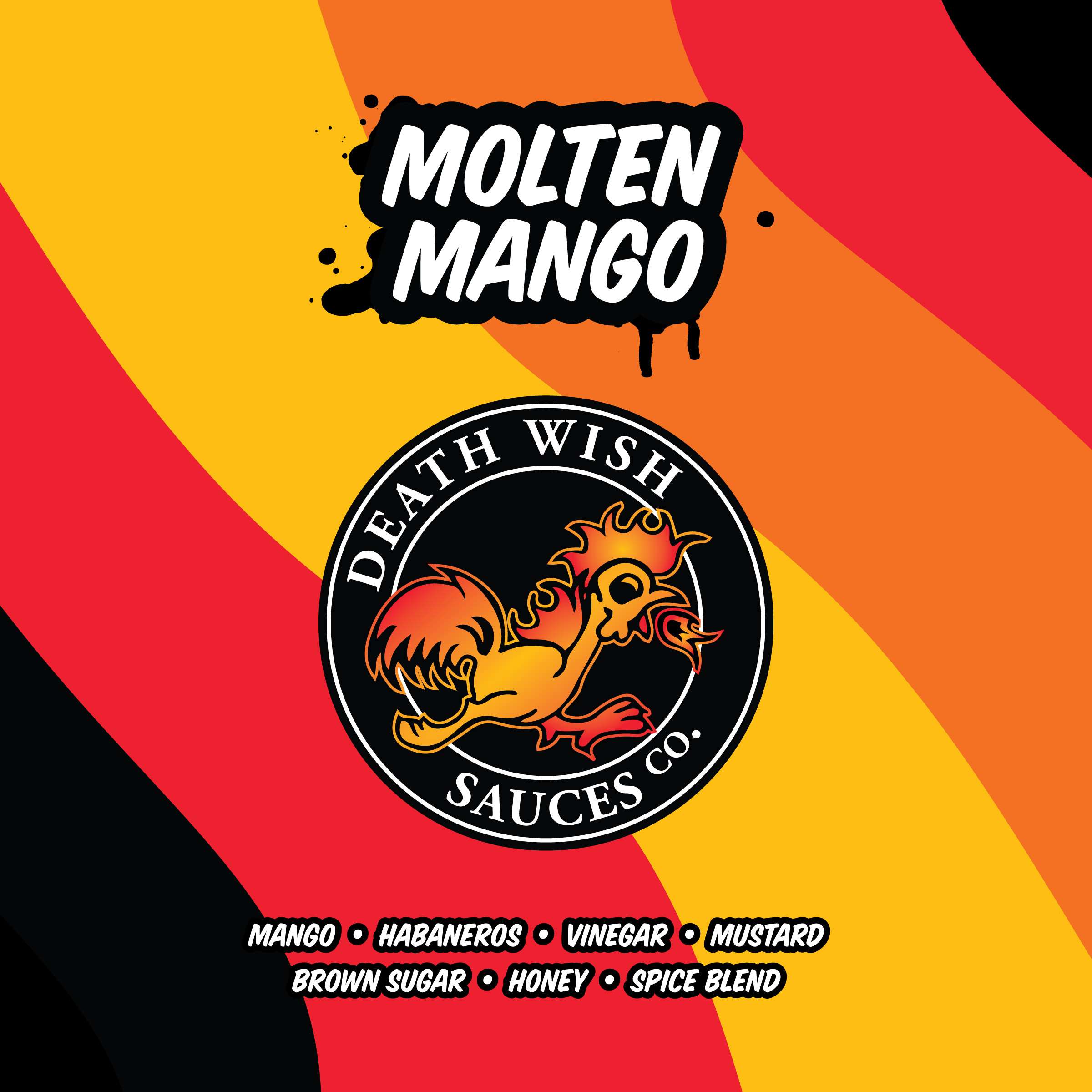
the ConceptSymbolism of Life & Death, or simply Black & White. An attention seeking Rooster representing a loudmouthed talking piece. It's flaming colors inspired from the ingredients, Orange from the Habaneros and Peachy/Yellow from the FL Mangos.
02
the art directionVibrant colors needed to highlight the product and standout on the shelf. The typography a bold serif font, similar to an official ceritficate. A clean product design, almost minimalism - that will translate well to an array of products and flavors.
03
the BrandThe addicting hot sauce, that came screaming across your plate. It's sweet and spicy flavors tantalizes your tongue... it's unwavering flames mezmorize your eyes. Flavor comes with a price, Do you have a Death Wish?


DESIGN + BRANDING
The design concept started with the rooster. I put together a mood-baord of a collection of inspiration artwork that resprented a clear vision of the artistic style.
Using melted skulls to hawaiian volcano art and array of rooster photos; I began to skecth some ideas. It had to be simple, like a tattoo outline - so my main inspiration was just that. Once the sketch was near complete, fire and flames were added.
COLOR PALETTE
The colors came next. Using my favorite material pallete, I choose the brightest red, yellow and orange to create a smooth flat gradient, which would contract nicely with a black circle seal. Keeping in mind the different products and flavors that same pallete was used for the creation of the two additional products : Power & Jelly.

TYPOGRAPHY
For the logo, I choose a Serif font : Adobe Garamond Pro - Bold Style. It adds that official / certificate look. Using all uppercase letter added to the title boldness, extra text, such as CO. was reduced to half the title size.
As for the alternate description, a more lax and artistic font was choosen : House Slant. It easy to read and bold enough to stand against the dark and vibrant colors of the label.
To give it that extra love, each product was given a unique stroke style that respresented it's name. Molten Mango rocks the melted drip look, while Burnin' Bird was given the flame treatment.

WEBSITE DEVELOPMENT
During the R&D phase of the Molten Mango product, we began working on the website. The first step was to build out a coming soon page. The Instagram page was already active and gaining more traction each day so, the main objective was to showcase the finished logo, grab emails for the newsletter and provide links to the active social media accounts.
CUSTOM COMING SOON PAGE
Using the design of the business card, I created a full-page splash-page with the flat gradient moving like liquid sauce. Thanks to a little help from Anime.js it was a quick process with a flashy result. For best results on multiple devices and platforms only vector images were use to retain the ultimate sharpness.
BIG CARTEL SHOP
There are really only a couple of legit options when it comes to online shopping platforms and the tools they provide to help run a business. Some are more robust and feature loaded, but expensive is not always right. For this project, we chose Big Cartel, purchasing their platinum plan at $9.99 per month.
My favorite thing about this platform is the mobile app that helps you manage and run your store. Take payments, create discounts, track views, get detailed graphs on sales, or even update products on the fly. Basically its super easy to get used to and non-tech people get it too.
It also gives you the ability to customize the shop, link your shop to Facebook and Instagram. Take PayPal payments, connect it to Stripe for Credit Cards or use the app for Cash. The ultimate startup platform for new businesses.

Utilizing my professional mockup and mixing in live photos, we set up the products to be front and center with no distractions. Like the hot-sauce world, we wanted customers to shop with their eyes first. The shop is live today with all three products, check it out and try a bottle of Death Wish Hot Sauce!
Launch Website